Turnaround times, rush ordering availability and other responsibilities
- Large-format poster printing turnaround times
The department of Medical Communications offers a 48 business-hour turnaround time. We work from 8:30 a.m. – 5 p.m. weekdays. We are not open after 5 p.m. weekdays and we are not open during the weekends and university recognized holidays. Any submissions after hours/during those times will be processed for production the next business day. For example, you submit a poster on Monday at 3:30 p.m., it will be ready on Wednesday at 3:30 p.m. Because we run a tight production, we need to stick to that. If you have a large order that may require more time, its best to contact us beforehand. Please review below.
Submitted Monday before 5 p.m. - ready same time of submission on Wednesday.
Submitted Tuesday before 5 p.m. - ready same time of submission on Thursday.
Submitted Wednesday before 5 p.m. - ready same time of submission on Friday.
Submitted Thursday before 5 p.m. - ready same time of submission on Monday.
Submitted Friday before 5 p.m. - ready same time of submission on Tuesday.
Submitted Saturday/Sunday - ready same time of submission on Wednesday. - Flyers, brochures and signage
The department of Medical Communications typically offers a 48 business-hour turnaround time for brochures, flyers, and other signage. Depending on the quantity, some jobs may require a bit more lead time. We work from 8:30 a.m. – 5 p.m. weekdays. We are not open after 5 p.m. weekdays and we are not open during the weekends and university recognized holidays. Any submissions after hours/during those times will be processed for production the next business day. For example, if you submit a poster on Monday at 3:30 p.m., it will be ready on Wednesday at 3:30 p.m. Because we run a tight production, we need to stick to that. If you have a large order that may require more time, its best to contact us beforehand. Please review below.
Submitted Monday before 5 p.m. - ready same time of submission on Wednesday.
Submitted Tuesday before 5 p.m. - ready same time of submission on Thursday.
Submitted Wednesday before 5 p.m. - ready same time of submission on Friday.
Submitted Thursday before 5 p.m. - ready same time of submission on Monday.
Submitted Friday before 5 p.m. - ready same time of submission on Tuesday.
Submitted Saturday/Sunday - ready same time of submission on Wednesday. - RUSH orders
We understand sometimes there are issues preventing the 48 business-hour file submission. We do offer a RUSH fee of $25 per poster for 24 business-hour turnaround time. Please understand this fee is necessary because we have to rearrange tight schedules to accommodate the RUSH production order. A RUSH order may not be available at all times due to various reasons and we may temporarily suspend RUSH orders (such as Match Day, White Coat Ceremony, orientation, ERAS photos, medical education requests, etc. - where these events take priority). In those cases, we will put a notification on the homepage of our commerce site here: https://shop.prod.wayne.edu/biomedcom/biomedcom/
- Submitting your order
- We do not accept emailed files. Please create a work order through our commerce system here: https://shop.prod.wayne.edu/biomedcom/biomedcom/
- A work order will be generated and emailed to the address used in the work order.
- Please monitor the email account used with your work order. We will notify you through the work order system when your proof and/or order is ready for pickup. If there are any issues, you will be contacted.
- Your responsibility regarding printing dimensions
- When you submit a file to us for printing, it is assumed that you understand square footage - and that you will select the correct square footage when submitting your file for printing. It is also assumed you know how to round up to the nearest square foot.
- For example, if your poster measure 30" x 42" - you would round up to 3' (36") x 4' (48")
- Please be aware of the file dimensions you need for the final output size. Meaning, please don't submit a file with an incorrect ratio and then expect us to fix your error.
- If you submit a file that is the incorrect ratio, we will proportionally print and trim the white areas to fit.
- If your poster is so incorrect that the request is unreasonable/impossible to print, we will hold your order and contact you. This is considered busy-work because nothing meaningful is being produced other than having to explain what was submitted is incorrect. This is time consuming on everyone's part.
- Below are some of the common examples we receive regarding incorrect dimensions. Please review your file and make sure you are correct.
- Submitting a 3'x4' poster and expecting us to print it in the incorrect ratio of 4' x 8'
- Submitting a 3'x4' poster and expecting us to print it in the incorrect ratio of 2' x 2'
- Submitting a 3'x5' poster and expecting us to print it in the incorrect ratio of 3' x 4'
- Submitting a 3'x5' poster and expecting us to print it in the incorrect ratio of 3' x 6'
- If we need to contact you and put your project on hold while you sort out the dimensions, this bumps your submission to the back of the queue and it means your poster may not be ready when you originally anticipated. If you wish to have your poster ready at the original time of submission, we reserve the right to add an additional $25 RUSH fee for the inconvenience if we are rushed into printing the order to meet the original accommodation.
- Please be aware the issues we referenced above don't have to be issues if a few moments are taken to double check sizes before submitting the poster.
- When you submit a file to us for printing, it is assumed that you understand square footage - and that you will select the correct square footage when submitting your file for printing. It is also assumed you know how to round up to the nearest square foot.
- Your responsibility regarding payment for services
- When you submit a file to us for printing, it is assumed that you will pay us for our services.
- We will not release work orders without full payment.
- We accept Wayne State IRB, all major credit cards, including Wayne State ProCards and checks payable to Wayne State University. Please do not call us with a grant number, we only accept the forms of payment previously listed.
- When submitting your order, please be aware of the method of payment. For instance, If you intended to pay by credit card and then come to pick up your order and you present us with a check, we have to cancel the order and recreate another one to accommodate the unexpected change.
- Failure to promptly pay for our services will result in us sending the outstanding bill to Wayne State collections, which may negatively impact you.
- Failure to pick up your project does not absolve you from paying for our services. We provided the service of our time and consumable resources. Failure to promptly pay for our services will result in us sending the outstanding bill to Wayne State collections, which may negatively impact you.
WSU branding
- WSU colors
Colors
Wayne State University school colors are represented as green (PMS 561, hex #0c5449) and gold (PMS 1225, hex #ffcc33). There are no specific percentages of each color required for documents, but the takeaway should be an awareness of the school colors. Unofficially, black and white serve as supporting colors, primarily as the color of body copy.
Lightest green #acc9c0Lighter green #71a192Light green #3d7a67Base green #0c5449Dark green #093f39Darker green #072e29Darkest green #05211eLightest yellow #fff2c9Lighter yellow #ffe596Light yellow #ffdb6fBase yellow #ffcc33Dark yellow #d8ad2dDarker yellow #ae8f30Darkest yellow #866e26White #ffffffLightest Grey #f2f2f2Lighter Grey #e6e6e6Light Grey #d9d9d9Base Grey #babbleDark Grey #949999Darker Grey #575959Darkest Grey #323333Black #181a19ObservatoryLightest #B4F8DFLighter #87D5B8Light #43B087Base #179769Dark #0F734EDarker #0A573ADarkest #1A4032 - Logos
Wayne State University School of Medicine logos 

transparent PNG SOM horizontal Visit Wayne State University marketing and communications to download other WSU logos.
- Identity guidelines
The Wayne State University W shield reinforces the strength and determination of a Wayne State Warrior, building on the legacy and energy of what was previously the Athletics mark. The logo incorporates an updated Wayne State University type artwork, giving a nod to our traditions while providing a more contemporary alternative. Visit the marketing and communications WSU identity guide for detailed information.
- Creating accessible design with color and type
Contrast and color use are prerequisites to accessibility in design. Users, including individuals with disabilities, must be able to perceive content, which includes typography and information graphics. Universal Design is accessible and provides the same means of use for all users: identical whenever possible; equivalent when not. (Cook & Hussey, 2002; The Center for Universal Design, University of North Carolina 1997) The table below visually communicates good text contrast as defined by the Web Content Accessibility Guidelines (WCAG) 2.1. The WSU color branding text combinations below provide enough contrast between text and its background so that it can be read by individuals with moderately low vision. Contrast is calculated so color is not a key factor for individuals who have a color vision deficit will also have adequate contrast between the text and the background.
Good text contrast examples WSU primary green WSU primary Yellow Base grey White White on WSU primary green
WCAG: 8.8:1 contrast ratioMinimum contrast (AA)
Enhanced contrast (AAA)
Non-text contrast (AA)Black on WSU primary yellow
13.9:1 contrast (AA)Minimum contrast ratio (AA)
Enhanced contrast ratio (AAA)
Non-text contrast (AA)Black on lighter grey
16.8:1 contrastMinimum contrast (AA)
Enhanced contrast (AAA)
Non-text contrast (AA)Black on White
21:1 contrast (AAA)Minimum contrast (AA)
Enhanced contrast (AAA)
Non-text contrast (AA)WSU primary yellow on WSU primary green
5.9:1 contrast ratioMinimum contrast (AA)
Enhanced contrast, large text only
Non-text contrast (AA)WSU primary green on WSU primary yellow
5.9:1 contrast ratioMinimum contrast (AA)
Enhanced contrast, large text only
Non-text contrast (AA)WSU primary green on lighter grey
7.7:1 contrastMinimum contrast (AA)
Enhanced contrast (AAA)
Non-text contrast (AA)WSU primary green on white
8.8:1 contrast (AAA)Minimum contrast (AA)
Enhanced contrast (AAA)
Non-text contrast (AA)Lightest green on WSU primary green
5.1:1 contrast ratioMinimum contrast (AA)
Enhanced contrast, large text only
Non-text contrast (AA)Dark, darker and darkest green on WSU primary yellow
Minimum contrast (AA)
Enhanced contrast (AAA)
Non-text contrast (AA)Dark, darker and darkest green on lighter grey
Minimum contrast (AA)
Enhanced contrast (AAA)
Non-text contrast (AA)Dark, darker and darkest green on white
Minimum contrast (AA)
Enhanced contrast (AAA)
Non-text contrast (AA)Lightest green on darker green
8.3:1 contrast ratioMinimum contrast (AA)
Enhanced contrast (AAA)
Non-text contrast (AA)WSU primary green on lighter yellow
7.1:1 contrast ratioMinimum contrast (AA)
Enhanced contrast (AAA)
Non-text contrast (AA)Darker grey on lighter grey
6.9:1 contrast ratioMinimum contrast (AA)
Enhanced contrast, large text only
Non-text contrast (AA)Darker grey on white
7.1:1 contrast ratioMinimum contrast (AA)
Enhanced contrast (AAA)
Non-text contrast (AA)WSU primary green on lightest green
5:1 contrast ratioMinimum contrast (AA)
Enhanced contrast, large text only
Non-text contrast (AA)WSU primary green on lightest yellow
5:1 contrast ratioMinimum contrast (AA)
Enhanced contrast, large text only
Non-text contrast (AA)Darkest grey on lighter grey
10.2:1 contrast ratioMinimum contrast (AA)
Enhanced contrast (AAA)
Non-text contrast (AA)Light green on white
5:1 contrast ratioMinimum contrast (AA)
Enhanced contrast, large text only
Non-text contrast (AA)- Minimum contrast (AA) - text has a contrast ratio of at least 4.5:1 for normal sized text (at least 8 points) and at least 3:1 for large scale text (at least 18 points regular and 14 points bolded) against adjacent colors.
- Enhanced contrast (AAA) - text has a contrast ratio of at least 7:1 for normal sized text (at least 8 points) and at least 4.5:1 for large scale text (at least 18 points regular and 14 points bolded) against adjacent colors.
- Non-text contrast, UI components and graphical objects (AA) - Visual presentation of user interface components and graphical objects must have a contrast ratio of at least 3:1 against adjacent colors.
- Read more about web contrast accessibility guidelines, (WCAG) 2.1.
Refer to the WSU color branding chart on the FAQ page for hex/rgb color values. In addition to ensuring the contrast is readable, the size of the font also affects its legibility.
- Reading text on hand-held pages should be a minimum of 8 point font.
- Any posters that are meant to be read at a minimum distance, the following sizes are suggested:
- Title: 80 pt bolded
- Authors and affiliations: 54 - 60 pt
- Headings: 36 pt
- Body text: 24 - 32 pt
- Captions: 18 pt
- For readability, the following sizes are suggested for the body text:
- To be legible at 6 feet use 30 point.
- To be legible at 10 feet use 48 point.
- To be legible at 12 feet use 60 point.
- To be legible at 14 feet use 72 point.
- Text and figures should be readable from around 5-7 feet away
- Use a sans serif typeface (e.g., Lato, Arial, Open Sans, Helvetica, etc.). Our poster templates use the sans serif font Lato, which can be downloaded from the link provided on our FAQ page.
- To maximize readability, use a 1.4 or 1.5 line height (line height of 140%/150%, equal to 1.4/1.5 times the font size)


Page set-up for PowerPoint™ posters
- Page set-up
When you attend a conference or an event, the organizers will give you the maximum area that you will have for a display. Consider this size first and foremost before creating your poster layout.
What to consider if using PowerPoint: There is a maximum size limitation: PowerPoint allows a maximum page size of 56 inches.
If you need your poster larger than 56 inches, we recommend creating it half size. We would print it for you at 200% to fit your size.
Example:
3′ x 6′ page setup = 18″ height x 36″ width
3′ x 7′ page setup = 18″ height x 42″ width
4′ x 6′ page setup = 24″ height x 36″ width
4′ x 8′ page setup = 24″ height x 48″ widthWe also offer poster templates on our downloads page to get you off to a great start!
- Changing your page set-up
In Microsoft PowerPoint: select the "Design" tab in the top ribbon; select the "Page Set-up" icon; enter the values in those fields.
On Macintosh PowerPoint™: select "File"; choose "Page Set-up"; enter the values in those fields.
- Exporting a PDF file from your work
In Microsoft Windows and MacOS PowerPoint:
select "File"; choose "Save As"; under Format, choose "PDF" - Presentation tips
Create an effective presentation
When you are creating your presentation, a good rule to remember is to "KISS", or Keep It Straightforward Simple. Only put in information that is essential. Outline your thoughts. If you are reading aloud what you have written in the slide, you will surely bore your audience.
- Use dark backgrounds and light colors for your text. Use text that is 24pt or larger.
- For section headings (e.g., Introduction), use a bold font size of about 36-44.
- For supporting text (e.g., text within each section & figure captions), use font sizes of about 24-28 (bold, if appropriate).
- Use font sizes proportional to importance to establish a hierarchy:
- largest font size- Title
- next largest font size – Section headings medium font size –
- Supporting material smallest font size – Details
- Use Helvetica or Arial fonts, not "Times" or other serif fonts. Helvetica and Arial (sans serif) are bolder and easier to read.
- Use a consistent background throughout. Changing backgrounds, fonts, graphics makes your reader confused. Add Clip art only to add impact to a specific message — not on every slide.
Grab the reader's attention!
Creating slides that get the viewer's attention is not about which pictures to include. It's about using the space on your slides effectively. Don't crowd your slides, and only include elements that contribute to the points you want to make. When you use graphics on a slide, choose images that serve a purpose (such as a chart or diagram that displays a direct benefit of your idea). Take a look below at the 4 ways to help grab and keep your viewer's attention.
- Use sound recordings when sending a presentation electronically. A clean slide that emphasizes key points is more effective than a slide that contains every word you intend to say. But, what do you do if you're sending your presentation electronically? Consider recording narration to accompany your slides.
- Use Notes and Handouts to help you stay on track or to create quick and easy leave-behinds for your viewers. Use the Notes pane that appears below the slide in Normal view to write notes to yourself for your presentation, or to create notes that you can print for your viewers. You can also format and print handouts that contain up to nine slides per page.
- Create charts and diagrams that emphasize your key points. To chart data in PowerPoint, start by clicking the Insert Chart icon on any AutoShapes to create any type of diagram or flowchart can provide much more flexibility without much more work.
- Use animation and slide transitions consistently and sparingly. Having text and graphics appear on-screen just when you need them can be a nice touch. However, using too much animation can distract from your presentation's content.
- For effects that emphasize your points without overwhelming your audience, limit animation to key points and use consistent animation choices throughout the presentation.
- Subtle and consistent slide transitions can also provide a professional touch without being distracting
Stay in control of your presentation!
Custom colors, layouts, and graphics can do a lot for your presentation. But a misaligned flowchart, or a presentation that crashes on your client's computer, isn't likely to make the impression you want.
- Keep file size manageable. A common cause of stress with PowerPoint presentations is that the file size becomes too large to edit or to run the presentation smoothly. Fortunately, this problem is easy to avoid by using smaller picture file types, compressing pictures, and using native PowerPoint features whenever possible (such as tables, charts, and AutoShapes) instead of embedding and importing objects.
- Use the available tools for creating perfect diagrams. One of the great things about PowerPoint is that getting something perfect is easier than getting it close.
- Instead of nudging objects until your eyes get tired, use the Align Or Distribute tools. They can help you perfectly align and evenly distribute objects in a click.
- You can also use Guides to align and space objects. Guides can help you measure distance and keep the positioning of elements consistent across multiple slides.
- Zooming in on an object in PowerPoint can greatly increase the accuracy of what you see.
- Know exactly what the recipient of your presentation will see. If you're sending a presentation by e-mail, try saving the presentation as a Slide Show so that it automatically opens for the recipient in slide show view.
- If you're sending a presentation on CD, the Package for CD feature in PowerPoint is a great time and stress-saver. This feature will set up your presentation (including linked files) on a CD so that the slide show will run correctly for any recipient. It even adds a PowerPoint viewer so that the recipient's computer doesn't need PowerPoint to run the show.
- Use Slide Masters for consistency and to save time. In addition to customizing elements of slide layouts (as discussed earlier in this article), you can use the masters to save time and keep slides consistent by adding graphics and formatting just once for all slides.
Poster proof process
- What is a poster proof?
A poster proof is an 11x17" (tabloid) printout of your poster. This is double the size of a letter page so you can easier read the content. Use this to make sure your text doesn't run together, images don't fall off the page, and to catch other issues that may not be so apparent when designing this on the screen.
- Proofing process
If you order an 11x17" (tabloid) proof, we will print that out and let you know its ready for pickup. We try to print it out quickly so you have time to review it and process the final work order within 48 business hours. Please keep in mind that we may be out of the office on assignment or in the studio with another project so be sure to give yourself some time to pick up the proof.
Once you pick up the proof, if you take it back to your office for review, we mark the order "out for review" and it will not be printed until we receive confirmation the original file is good to print or you email us the revision. Once the proof has been printed and you are notified to pick it up for review, one of the following will take place:
- You review the proof and there are no changes, we will print the file that came with the work order.
- There are changes to the file. You make the changes to your file and then email it to medcom@med.wayne.edu. Reference your work order number so we can correctly pair the file to the original work order. Please do not create a new work order.
- Please note that the final printing turnaround time is 48 business hours from the time the proof was approved.
Typical file types we work with
- Microsoft
We work with common Microsoft™ programs such as PowerPoint, Word, and Excel. Unfortunately, at this time, we do not support Microsoft Publisher. If you have a Publisher file, you must export it as a PDF in order for us to print it.
We use Microsoft OneDrive to send/receive large files to customers.
- Adobe Creative Cloud
We work with all of the Adobe Creative Cloud™ programs. The most common files we create/edit are Photoshop, Illustrator, InDesign, PDF, After Effects, Premiere, Lightroom, Audition, and more. If we are inheriting your files for production, they must be properly packaged (meaning all supporting links [photos, music, fonts, etc] must accompany the master art file).
Crop marks and bleeds for full bleed trimmed prints
- Crop marks
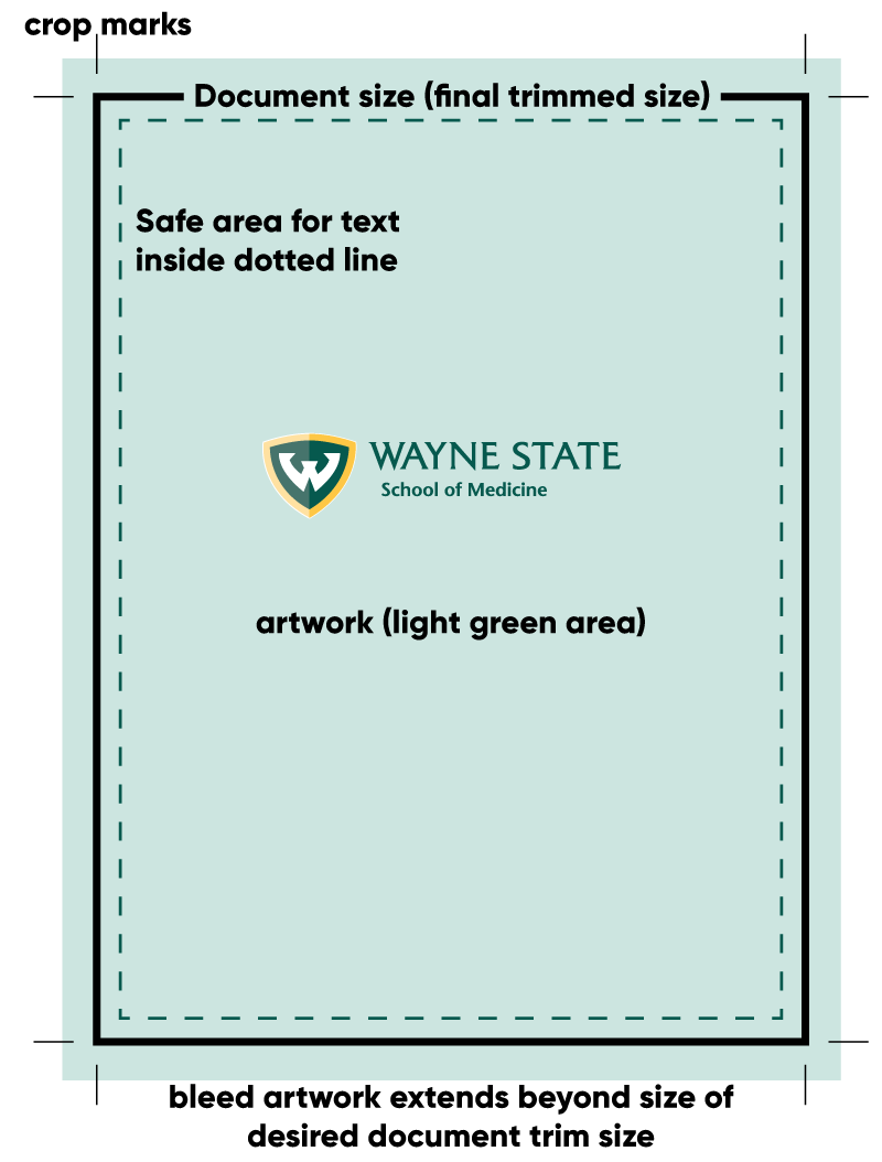
Crops marks are a set of marks that define a printed area. They tell the printer the boundaries/size of the printed area. As it has to be trimmed to its correct dimensions, the crop marks indicate where the document will be cropped. They are the little lines that you can see around the edges of your artwork.
- Bleeds
A bleed is the image or artwork extending beyond where the document will be trimmed. This is because laser printers cannot print to the edge, so if you want the ink to print to the edges of the page without a margin, you must extend the artwork beyond.
A bleed ensures you won't get white lines around the edge of your page when it is trimmed down. Because we guillotine large stacks of paper at a time, allowances need to be made movement within the sheets. Bleed gives us a 1mm tolerance around the edge of your page.
If you want a letter-sized page to have the artwork run to the edges, you must export your document with crop marks and bleeds. We would then print on a tabloid-sized page and trim it to size.
- Example of proper file setup for trimming with crop marks and bleeds
See the following graphic for crop marks/bleeds/trim setup. Keep in mind crop marks do not touch the corners of the document size to allow for a safe trim area.
Proper medical imagery concerning the caduceus and the Rod of Asclepius
- Caduceus and the Rod of Asclepius
The caduceus is the traditional symbol of Hermes and features a representation of a staff with two entwined snakes and two wings at the top. Despite the ancient and consistent association the caduceus has with trade, deceivers, thieves, and alchemy, it is often used incorrectly as a symbol of medicine, especially in the United States.
To this day, it is incorrectly used in the news, medical promotional materials, and even professional organizations. Please remember – just because everyone else is using it doesn't mean that its correct. The Rod of Asclepius belongs to Aesculapius, who was the revered Greek god of healing – this is the correct image.
The department of medical communications will halt any production that incorrectly uses the caduceus. Subsequently, we will not approve any visual communication that uses the caduceus on official WSU SOM branding.

For further reference, please visit:
- Rod of Asclepius image download


Personal responsibilities for content
- Personal responsibilities
- We understand that many of the files that come through our office contain sensitive information relating to medical research. Our staff has taken the HIPAA training and we take measures to ensure all information is confidential.
- It is assumed when you submit a file to us for printing, it has been proofread by the appropriate parties. We do not proofread. On occasion, if we happen to notice a grievous error, we will halt production and contact you for a resolution. Ultimately, you are responsible for the content.
- The department of medical communications takes pride in Wayne State University - a world class urban research university and we will do everything we can to educate you on best practices and support your project.
- Copyright information
When you submit a file to us for printing, it is assumed that you are the full copyright owner of said work. We will not print copyrighted work that does not belong to you (e.g., photos, movie posters, flyers, etc). Please do not ask us to, no matter the reason. Visit the Wayne State Office of General Council to read more about patents and copyrights.